Project Information
- Category: Design
- Purpose: Wireframe
- Date: November 25th, 2016
- Wireframe: See Wireframe
- Report Link: Open Report
Making a Low-Fidelity Prototype to Design the Homepage Interface of a Tea Room's Website
I made this wireframe for an assignment in the Design of Interactive Computational Media (CSC318) course at the University of Toronto.
For this assignment, I was instructed to create an imaginary cafe or tea room along with its own brand, products and customer base.
Subsequently, the goal was to then create a low-fidelity prototype (wireframe) of the cafe's/tea room's website homepage which would appeal to the cafe's/tea room's brand and customer base.
A report also had to be submitted, explaining design choices and why they were made to serve the goals of the interface and its usability.
First, I decided to create a tea room brand.
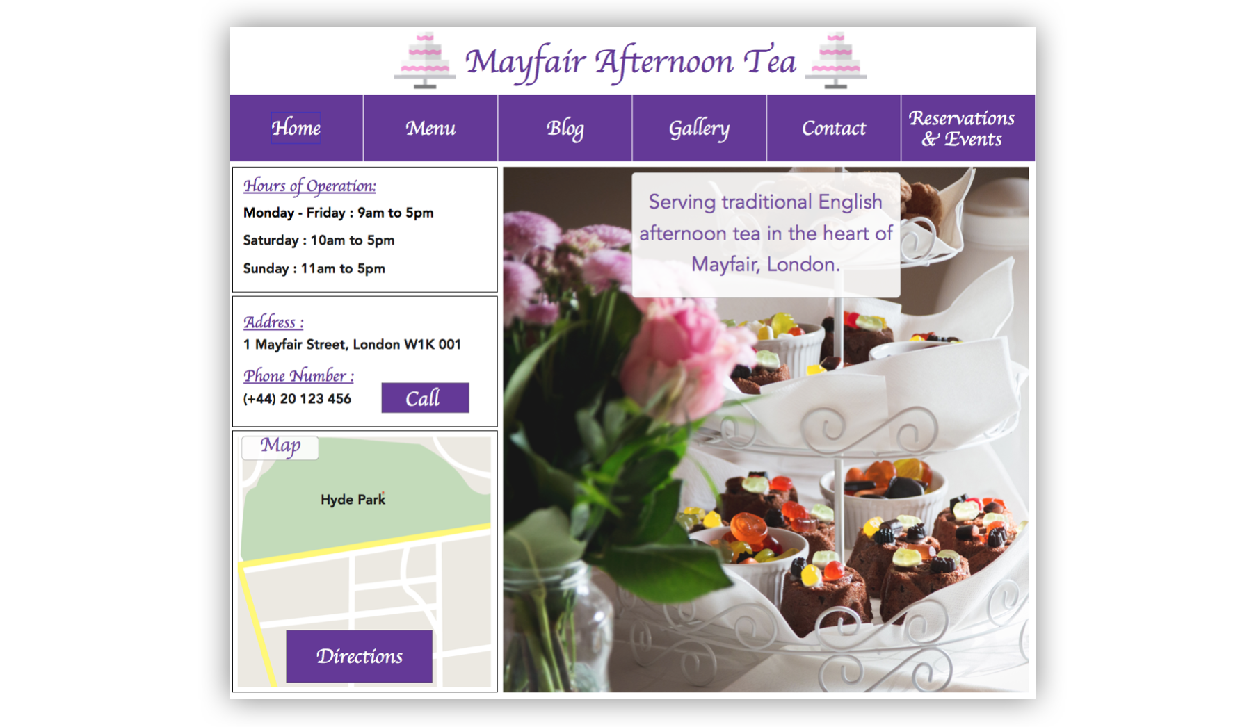
The tea room I created is called 'Mayfair Afternoon Tea' and is situated in the heart of Mayfair, a wealthy district in the heart of London.
Here is a description of my imaginary tea room from my report:
- ‘Mayfair Afternoon Tea’ is a traditionally themed English tea house situated in the heart of Mayfair (a wealthy district of London, England) that serves traditional English afternoon tea. Afternoon tea is an assortment of desserts and cakes accompanied by various English teas. Since ‘Mayfair Afternoon Tea’ is situated in a wealthy area of London, the interior is kept extremely clean and has a very well decorated/expensive design. The interior slightly resembles a small room plucked from the Palace of Versailles. All cutlery and tea kettles are made of silver, and all glasses are made of crystal. Furthermore, all tables are covered with white cloth, which is replaced after every seating. Overall, the tea house has the feel of an expensive fine dining restaurant, except it only serves afternoon tea.
- The primary customers of ‘Mayfair Afternoon Tea’ are people who enjoy tea with an assortment of desserts, where the desserts can be sweet or savoury. However, to be more precise, ‘Mayfair Afternoon Tea’ is not supposed to be what many would consider fast and affordable, it is supposed to be a traditional experience of British culture, therefore the primary customer base will consist of people willing to spend a considerable amount of time and money on their afternoon tea.
These design choices resulted in the final wireframe, which I created in Xtensio. As evident in the wireframe, I decided to place information of most importance for a tea room on the homepage in accessible areas with plenty of space to avoid clutter. The hours of operation information, contact information and the map with the tea room's location have their own section. The website's menus are placed in a horizontal navigation bar to avoid confusion and also provide easy access. The tea room's logo takes centre stage at the head of the homepage to provide good brand awareness. Finally, it is of great importance for a tea room to entice customers by visually showing their product, so I decided to reflect this in the design by dedicating a large section of screen real-estate for a photo of the tea room's afternoon tea selection. Additionally, this helps the whole interface breathe and maintain an organised structure. See my report for more details.
Skills Demonstrated:
- Creativity
- Wireframe Prototyping
- Interaction Design
- Interface Design
- Visual Design


