Project Information
- Category: Design
- Purpose: Interaction Design Project
- Project Report: Open Report
- Interactive Prototype: Download Interactive Prototype
A User-Centred, Iterative Design Process to Design a Smart Bracer for Use in Outer Space
This project was the course project for the Design of Interactive Computational Media (CSC318) course at the University of Toronto.
The project was a semester-long iterative human-centred design project, which I completed with 4 other team members (see the report for more details).
Introduction
We were briefed to design an innovative interface for use in an extreme environment.
As a group we chose to design a smart bracer (wearable wrist tablet) prototype for use in outer space, or colony bases on foreign planets, to assist astronauts with life support systems.
This gave us an extremely exciting opportunity to think outside the box and design a system that would become essential in future space exploration.
Efforts for space colonisation will likely fail unless there are advanced systems in place to sustain human life.
Every resource and piece of infrastructure will require constant and precise monitoring by its inhabitants, and in a fragile environment such as space, there is little room for error.
For example, an average Mars colonist will be exposed to an extremely large and complex workload, and may need to respond quickly to emergency situations.
This leads into our problem space, which addresses the need to reduce the complexity of a martian’s workload and to reduce the possibility of human error via technological assistance.
The variability of this problem is what makes it interesting.
There is a need for colonists to have technological assistance; however, what degree/type of assistance would be optimal?
Development of such systems is constrained by expenses (time and money), and there are benefits to leaving some tasks up to humans.
This is an open-ended optimisation problem, and it also raises the question of what should be prioritised.
The following explains the phases of our design process throughout the semester.
First, we researched our problem space (reducing astronaut workload and human error in outer space through assistive technology) in order to explore problems and potential solutions.
To do this, we analysed research papers relevant to the problem space and conducted user research through interviews, questionnaires and field studies.
The technological and financial feasibility of exploration on Mars has been investigated constantly by researchers as pioneering Mars is at the forefront of human exploration.
Alling, A., Nelson, M., Silverstone, S., & Van Thillo, M. investigated the human factor considerations of long-term space habitation in their article Human factor observations of the Biosphere 2.
They identified that the colonists must meet stringent physiological and psychological requirements, that they should have substantial knowledge of the construction of life support systems, and noted a need for a more comprehensive real-time modelling and information system, in order to help colonists make better and faster decisions.
User Research
To conduct our user research, we questioned participants with a questionnaire and then interviewed those participants, aiming to answer two questions: what aspects of technology are users most comfortable with, and which kinds of tasks would it be useful to automate or simplify using technology?
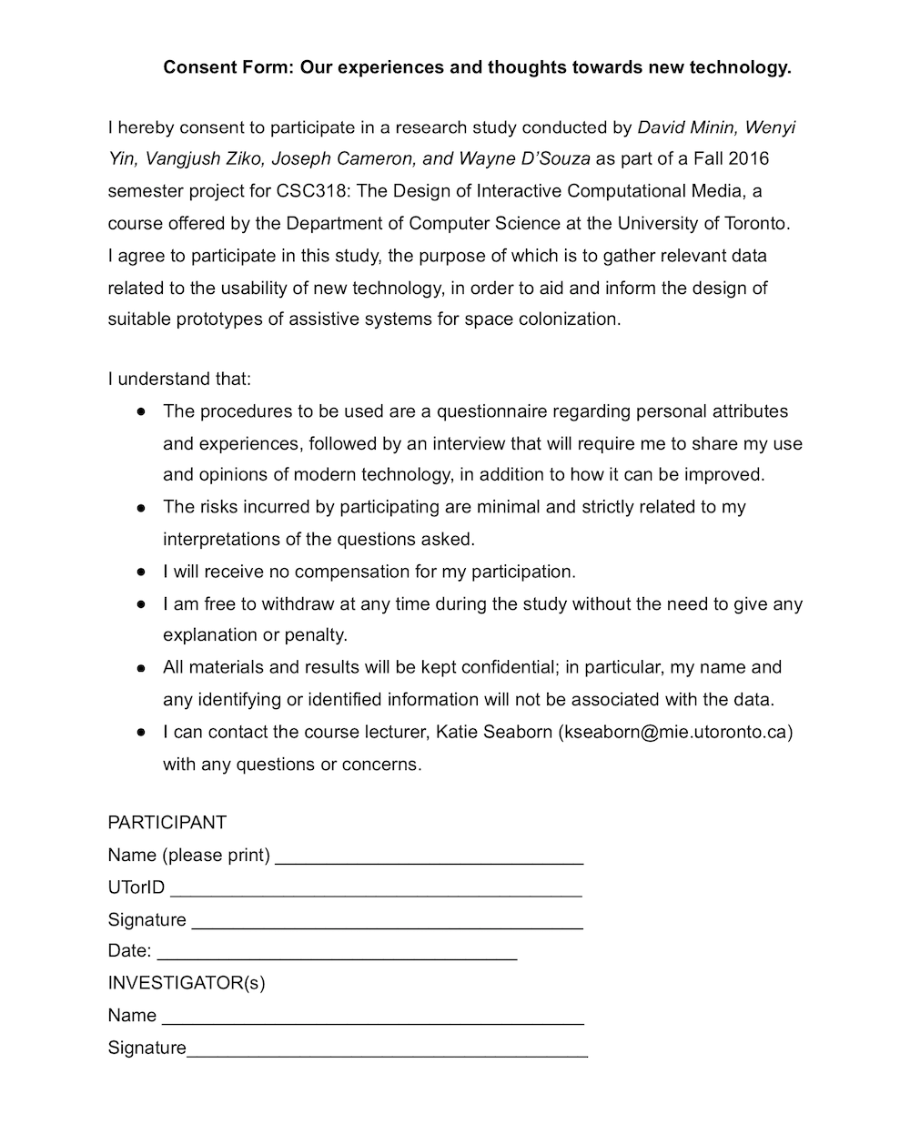
Here is a photo of the consent form we asked all participants to fill out for accordance with ethical guidelines:
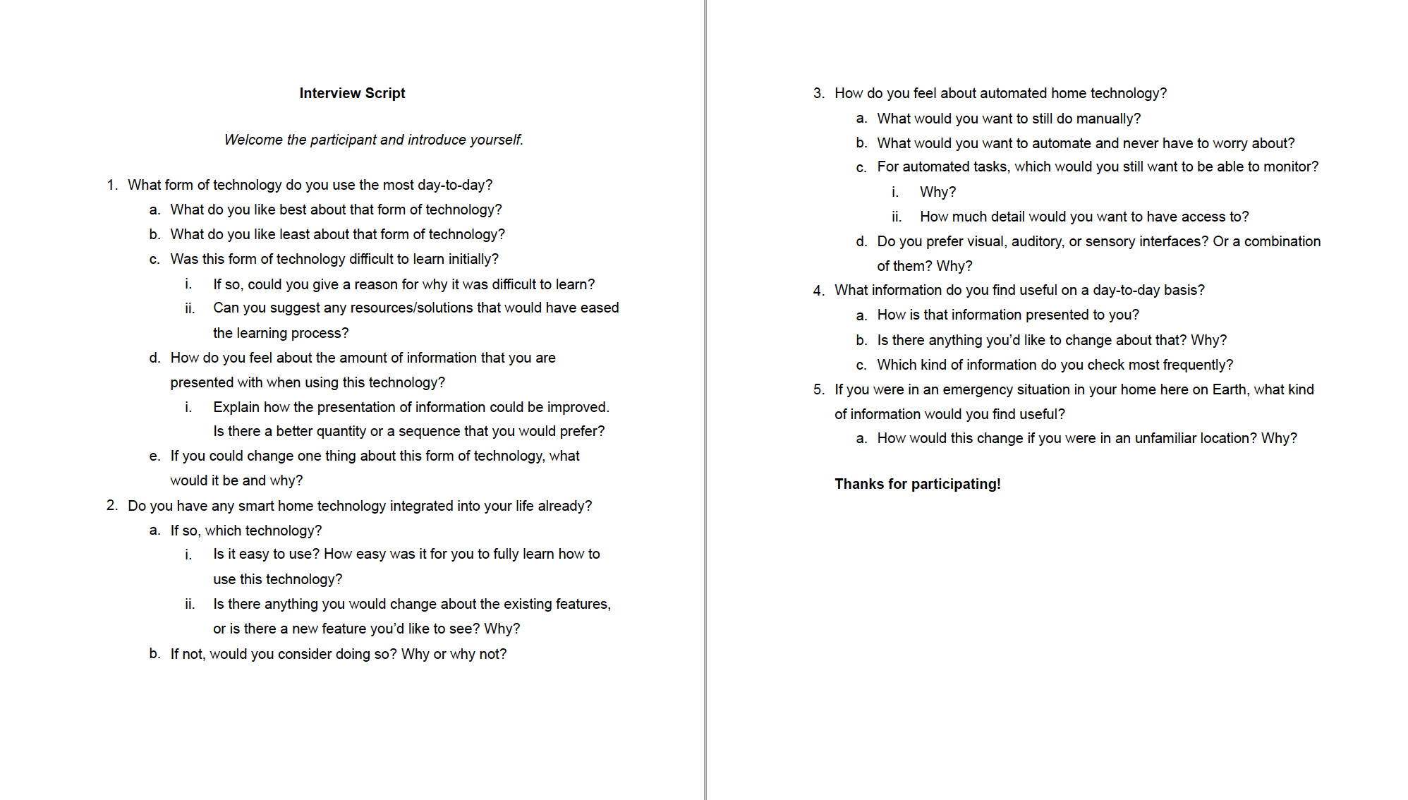
We realised that understanding the needs and wishes of users here on Earth would be a crucial stepping stone to design a system for outer space. From the questionnaire, we found that an overwhelming majority of participants were familiar and proficient with their computer and/or phones for completing various tasks. Furthermore, we gathered data on automated systems and preferences for automated tasks. A majority of subjects indicated that they would like chores to be automated, for the primary purpose of saving time. However, responses were split for more complex tasks like driving. Subjects trusted automated systems to perform tedious and simple tasks, but not complex and variable tasks. The interviews gave us more insight into how users might respond to specific interfaces. Subjects were more concerned with performance than learning curves and were very receptive to automated home tech for completing menial tasks. On the information presentation side, subjects wanted information to be sorted by priority, and to be visible all in one place. Useful day-to-day information mentioned by subjects fell primarily under real-time environment updates. Here is a photo of the interview script we used when conducting interviews with our participants:
After combining and discussing results with the team, we decided to focus on designing a device that can help astronauts control basic life support systems, such as activating airlocks and messaging fellow astronauts, because our research had shown that it is menial tasks that people would rather have handled automatically instead of cognitively challenging tasks, especially in the context of an extreme environment like a martian colony base. As a result, we drafted a list of requirements that we deemed necessary to include in our solution and began designing initial low-fidelity prototypes of our system to test with participants.
We also created some user personas at this point, to help guide us through the rest of the design process. Our user personas were astronauts, with technical backgrounds and training who are looking to focus on their roles throughout space missions. From these user personas, it had already become clear that our new system would have to be designed with structure and order in mind, as these astronauts would want as little confusion as possible in potentially dangerous situations when managing life support systems in outer space.
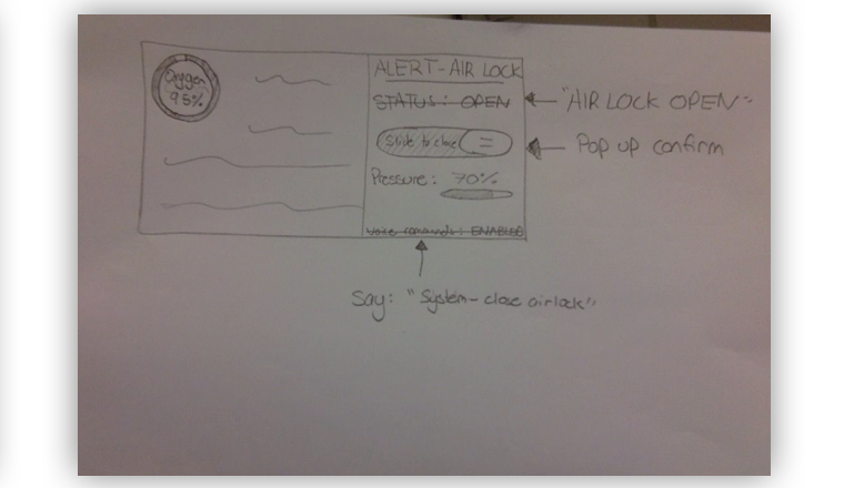
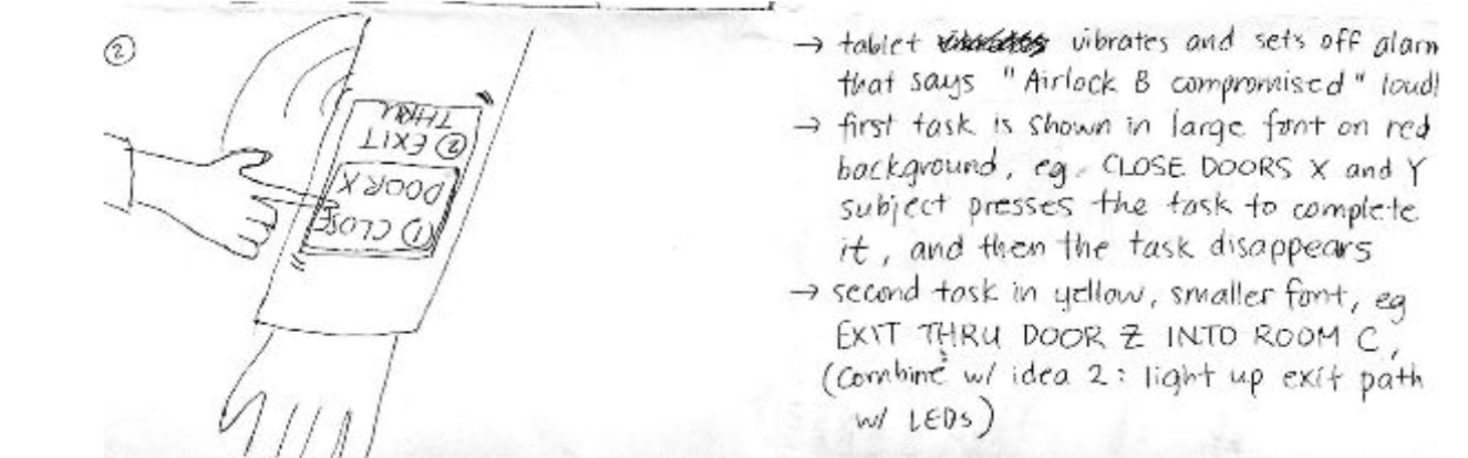
We began by sketching potential solutions to tasks found in our problem space, one of which can be seen below:

We also agreed that the best device for a user in our problem space would be a bracer that can connect to a spacesuit, since it is the most portable system. Eventually, we decided to go with the bracer idea and began our interface design with the solvability of our brainstormed tasks in mind. Our design emulated technology that users would be familiar with, such as a tablet or phone. We then sketched out solutions that this bracer device could provide when dealing with problems in space, as seen below:
Prototypes & Usability Research/Testing
Our initial paper prototype/low-fidelity prototype resembled a tablet in landscape mode with various functions displayed as buttons on a screen. A portion of the initial paper prototype, along with an improved update after feedback from usability research, can be seen below:
We iteratively improved our design using the feedback we obtained from usability research. We noted what worked well with our prototypes, and what did not work well, either through intentional feedback from the test user or through observation. For our usability research, we asked participants to carry out the following tasks with the prototype as an ice-breaker to start interacting:
- Task 1: “You have put on your astronaut suit. The suit has a special slot for the bracer. Dock your bracer in the suit and sync to it; view the oxygen level of the suit.” Participants needed to sync to the suit in order to view suit info.
- Task 2: “Send a message to your colleague, Bob, indicating that he should meet you in room A2 at 2pm.”
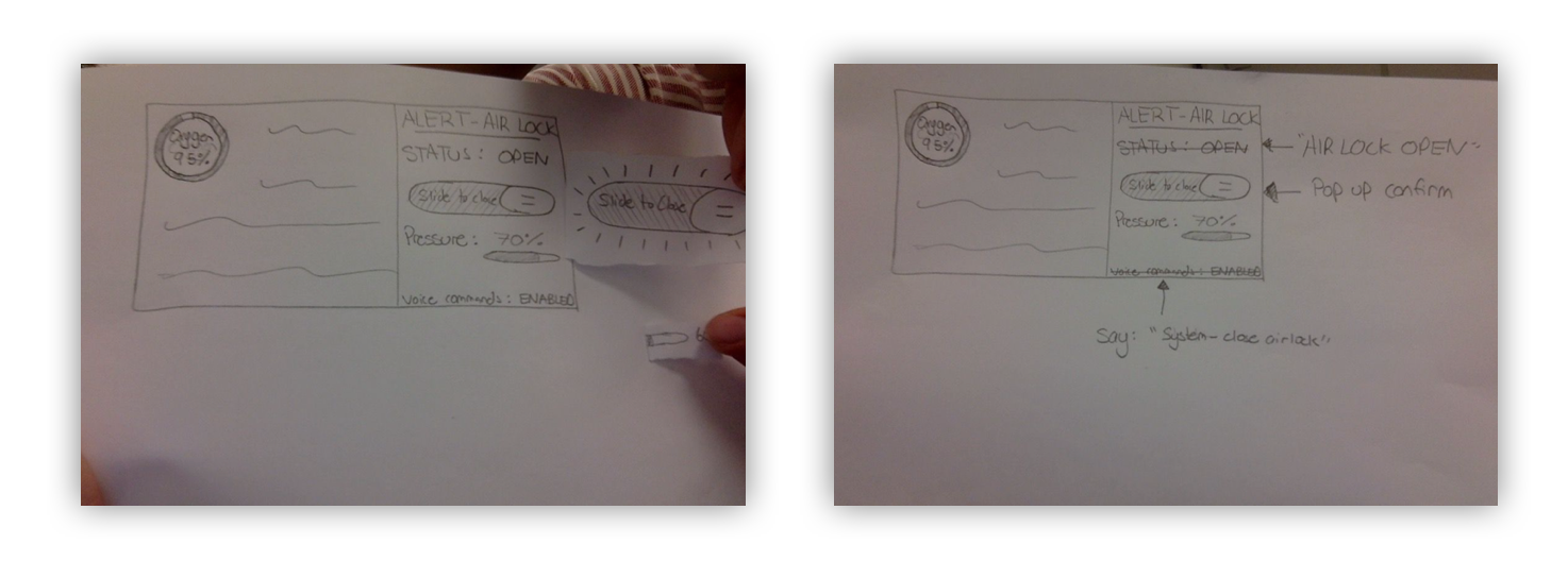
- Task 3: “You accidentally spill dangerous chemicals during an experiment. The room is contaminated, put the lab you are in under lockdown.” Participants needed to lock down the room by closing all airlocks connected to other rooms.
- For the syncing task (task 1), users were sometimes not sure what device they were syncing to. They also reported needing confirmation that the sync was successful and some indication of whether the device is synced or not. A final observation was that some users could not easily grasp how to unsync from the device, or choose which device to sync to.
- For the messaging task (task 2), users pointed out that when using voice commands to send a message, it doesn’t make sense to record a message and then choose recipient manually, just include recipient in speech (eg. ‘Send
...to Bob’). It was also generally unclear whether the device had detected/received/processed any speech input, the device should give better feedback on the current status of the system. - For the lockdown task (task 3), participants were initially unclear about what an ‘emergency lockdown’ is. They were also unclear about the function of airlocks in this context. Furthermore, no location info was given for either the airlocks or the user causing a lot of confusion. Users also seemed to think that there was no option to lock down any other airlock, other than the default airlock shown.
- A general issue that was observed was that participants would like more system status information visible, especially on the left screen.
- We would now represent the sync status with a symbol in the status bar: a red Bluetooth symbol if unsynced, a solid blue Bluetooth symbol if synced.
- We added an option to manually search for available devices and sync to them.
- We added an option to unsync from a currently paired device in the status bar.
- We added pop-up confirmation screens prior to most state changes.
- We replaced ‘file delivery’ with ‘settings’, which is more relevant and more frequently used.
- We added perpetual battery info in the status bar, and location & room air pressure on the left screen.
- Instead of ‘voice commands: ENABLED’ on the bottom of the screen, we replaced that with speech suggestion: "Say 'action' or 'action'" for more clarity.
- We made the left screen display relevant action-specific info such as suit information (oxygen level, temperature etc.) and messaging information (tabs for recently sent messages, inbox).
- For messaging we added; an auto-detect recipient feature from speech input, clearer instructions for speech format, eg. "Send 'msg' to 'name'", intermediate status screens for recording/processing/sending messages, an option to send another message after completion.
- For an emergency lockdown, we now use an entire screen for the task and the system status is not relevant to the task. We also removed all references to airlocks, instead opting to use ‘select rooms to lock down’ as the prompt. Crucially, we added a map to display the building layout and a marker for the user’s location on the left side of the screen, and we now require the user to select which rooms in the building to lock down by tapping the rooms and confirming the lockdown. For more clarity, we now represent closed airlocks using red Xs on the map.

Download the interactive prototype as an interactive PDF here. This interactive prototype was made as an interactive PDF, so it is recommended to open it in Adobe Acrobat Reader, but most PDF readers should work.
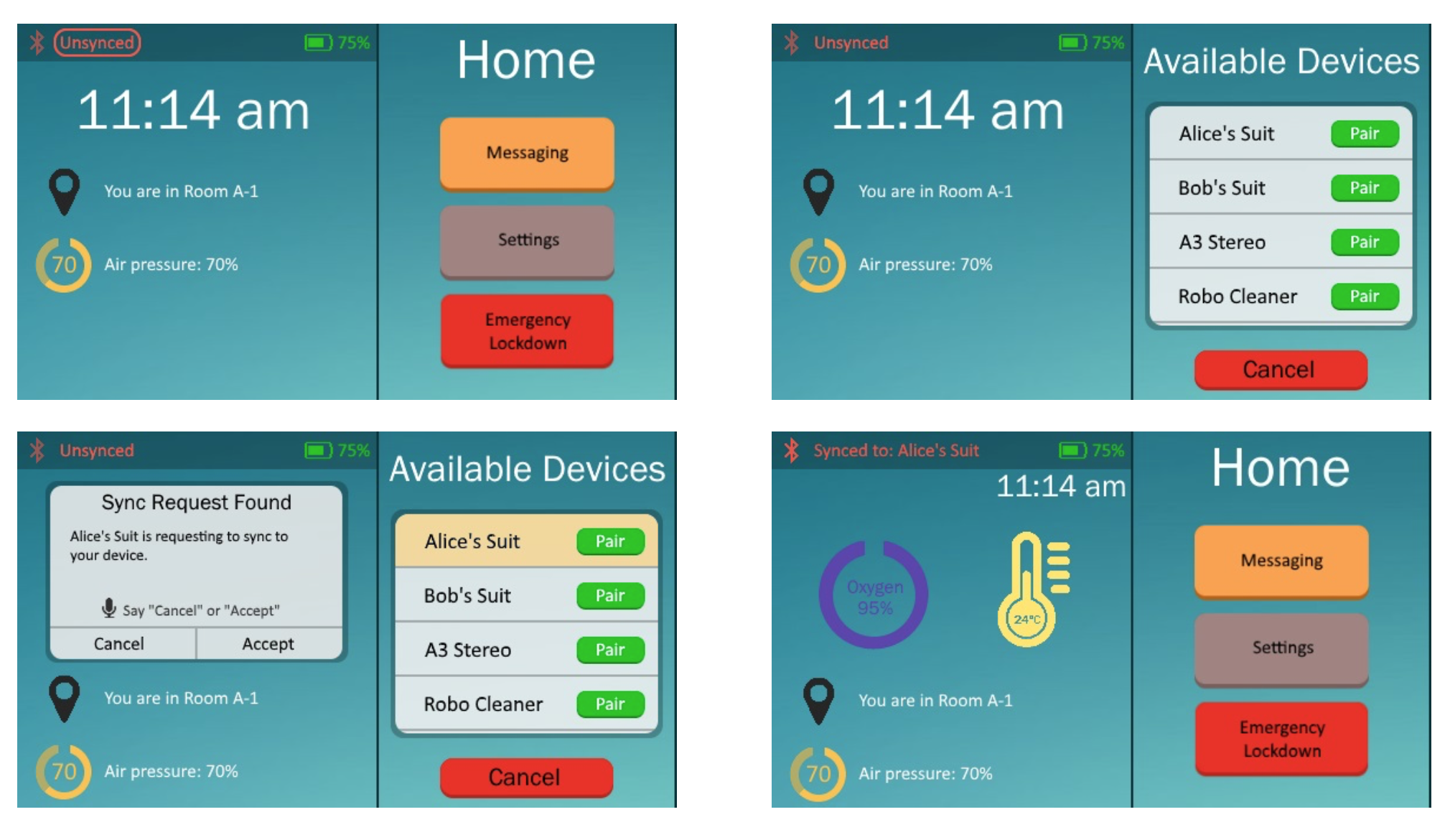
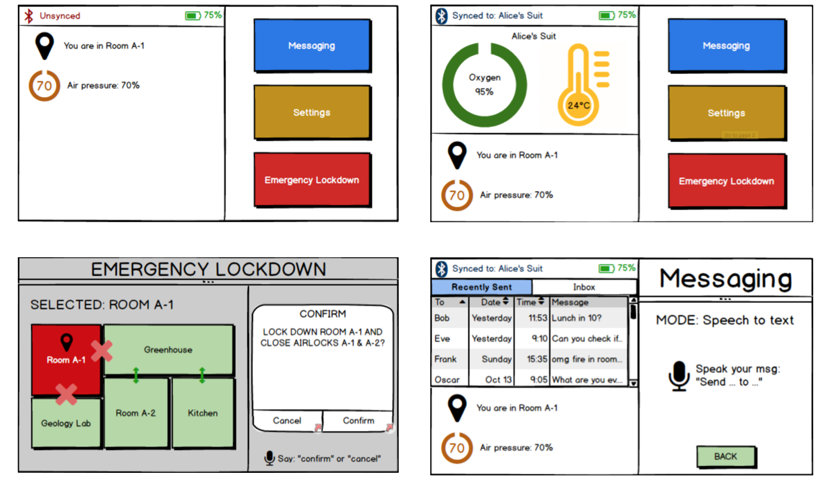
After repeating these iterations a few times, we came up with this final prototype:

The final prototype was made using MyBalsamiq. However, MyBalsamiq is now closing down and shutting its services, therefore only screenshots remain. Some major changes seen in the high-fidelity prototype were, the addition of menu names at the top of the right-hand screen, more system status information, more confirmation messages and a more aesthetically pleasing colour scheme. Our major design choices were as follows:
- We chose a horizontal layout for the screen of the bracer, following our intention for the bracer to be docked on the arm of the suit.
- We chose a left-right split-screen format so that we could display info from multiple scopes without requiring users to navigate through menus. The right-hand side was reserved primarily for actions, while the left-hand side was intended for status info (such as location, temperature, etc.).
- We frequently paired text with corresponding icons in order to give users quick visual cues (microphone, Bluetooth, loading bars, etc.).
- For the messaging function, we chose to implement it purely with speech-to-text mode, since users may not have their hands free and the screen may be too small for effective typing.
- We mostly reserved a bright red colour for emergency lockdown functions for obvious reasons (clear distinction from other elements, red = alert).
- We dedicated an entire screen for the emergency lockdown action since we didn’t want to distract the user with unnecessary info while they were attempting to complete a critical task.
Here is a table of colours we used in the final prototype:
| Colour Group | HEX Code(s) |
|---|---|
| Background Colour(s) | #1B788A, #68C0C1 |
| Text Colour(s) | #FFFFFF, #000000, #F25245, #5D40AD, #3A93A3 |
| Action Colour(s) | #FCA249, #A18482, #ED2D1E, #F25245, #00C611 |
| Icon Colour(s) | #00C611, #D5483D, #5D40AD #FFE76C, #FCA249 |
| Font/Typeface Name | Point Size |
|---|---|
| Calibri | 10, 12 |
| Franklin Gothic Book | 12, 16, 20, 28, 36 |
Conclusion
We learned how to make a user-friendly interface and a product that would benefit users in our given problem space. Through all the data we collected and multiple prototype stages, we refined our design, and we were happy with the outcome. As a next step, we would most likely add more functionality to the prototype and refine the information displayed to the user. Since this is designed as a smart wearable device, there is a lot it could potentially do, and the platform allows for a lot of flexibility.
Skills Demonstrated:
- Creativity
- Organisation
- User Experience (UX) Design
- Interaction Design
- Interface Design
- Visual Design
- User Experience (UX) Research
- Low-Fidelity Prototyping
- High-Fidelity Prototyping
- Usability Testing
- Good Teamwork